In a crowded marketplace where consumers are bombarded with messaging from every direction, effective signage can be a powerful asset. Whether it’s a shopfront sign, a banner at an event or directional signs inside a building, well-designed signage can do more than just display your business name—it can spark curiosity, communicate professionalism and drive foot traffic. For businesses aiming to stand out, knowing how to craft signage that grabs attention and leaves a lasting impression is essential.
Understanding the Purpose Behind the Signage
Before diving into the creative aspects, it’s crucial to understand the function of your signage. Is it intended to draw people into your shop, promote a limited-time offer or simply direct visitors around a venue? Each objective will influence the design choices, from colour palette to wording and placement. Signage that aligns with your purpose is more likely to connect with your audience. For instance, promotional signage should evoke urgency or excitement, whereas directional signs need to be clean and easily readable. Knowing your primary goal helps ensure your signage communicates the right message without confusion or visual clutter.
Harnessing the Power of Colour & Contrast
Colour is one of the first things people notice in signage. Bright, high-contrast combinations can make your sign stand out, particularly in busy environments. It’s important to choose colours that not only reflect your brand identity but also work harmoniously together to improve readability. If your business already has established brand colours, use them consistently across all signage to build recognition and trust. However, don’t shy away from using an accent colour to highlight key details such as calls to action or contact information.
Choosing the Right Fonts & Text Hierarchy
Typography plays a significant role in how your signage is perceived. Fonts that are too ornate or condensed can be difficult to read, especially from afar. Sans-serif fonts tend to be more legible and modern-looking, making them a popular choice for business signage. Equally important is establishing a clear hierarchy in your text. The most important message—be it the business name, a sale announcement or a directional cue—should be the most prominent element on the sign. Supporting text should be smaller and secondary, helping guide the viewer’s eye without overwhelming them.
Incorporating Branding Elements
Consistency is key when it comes to branding and your signage should reflect your visual identity just as much as your website or business cards do. Incorporate elements like your logo, tagline and brand imagery to create cohesion across all touchpoints. This not only reinforces your business’s identity but also helps build customer recognition over time. When people encounter the same fonts, colours and logos in different settings, it increases the likelihood they will remember your brand and associate it with professionalism and credibility.
Location & Visibility Matter
Where you place your signage can significantly impact its effectiveness. A beautifully designed sign is only valuable if people can see it clearly. Consider the viewing angles, surrounding environment and the lighting conditions. Outdoor signage should be weather-resistant and visible both day and night, potentially using reflective materials or illumination. Indoor signs should be placed at eye level and positioned in areas with sufficient lighting. Take the time to view your signage from various distances and perspectives to ensure it’s achieving maximum impact.
Keeping It Simple & Focused
One common mistake in signage design is trying to cram in too much information. Cluttered signs confuse viewers and can dilute the core message. Instead, focus on delivering one clear idea or call to action. A sign advertising a sale, for example, might simply say “50% Off Storewide – This Week Only” along with your business name and a relevant graphic. Short, punchy messaging is more likely to stick in someone’s mind, especially when they’re moving past your sign quickly, such as on the street or in a shopping centre.
Investing in Professional Design & Materials
While it may be tempting to cut corners with DIY signage, the results often fall short. Investing in professional design ensures that your signage is visually appealing, well-aligned with your branding and optimised for impact. In addition, choosing high-quality materials means your signage will last longer and maintain its appearance even under harsh conditions. For example, UV-resistant inks and durable substrates can help outdoor signs remain vibrant over time. Professional print and fabrication services also offer finishes like lamination, mounting and framing, which can elevate the overall look.
Testing and Updating as Needed
Even the best-designed signage can lose its effectiveness over time. Fading colours, outdated messages or changes in branding may necessitate updates. Regularly review your signage to ensure it still serves its purpose and presents your business in the best possible light. Additionally, consider testing different designs to gauge which styles and messages resonate most with your audience. This could involve A/B testing with different versions of a banner or rotating promotional signs to see which generates the most interest.
The Lasting Value of Quality Signage
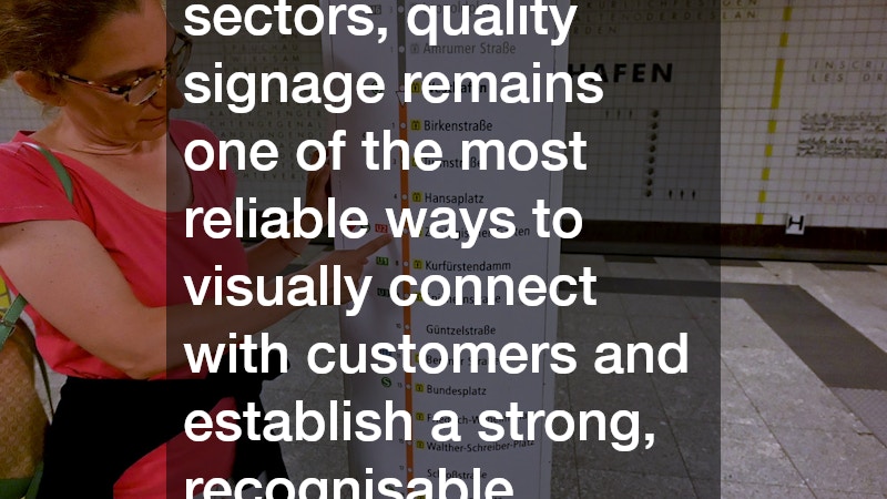
Creating effective signage for your business is both an art and a science. From choosing the right colours and fonts to understanding placement and branding, every detail contributes to the sign’s overall success. Thoughtfully designed signage not only captures attention but can also build trust, guide customers and drive revenue. As competition grows across all sectors, quality signage remains one of the most reliable ways to visually connect with customers and establish a strong, recognisable presence in the market.
.